Choosing an interior paint color is less about finding a shade you like and more about finding one that works with your flooring, cabinetry, stone, furnishings, and natural light.
A warm neutral may look balanced in one home and yellow in another. For homeowners throughout Metro Detroit, the best place to start is with the parts of the room that are staying.
Jump to Section
Key Factors That Determine the Right Interior Paint Color
What elements are staying in the room?
Paint is easy to change. Flooring, stone, cabinetry, millwork, and major furnishings are not.
- Flooring: Consider the undertones in hardwood, stone, tile, or carpet.
- Countertops and stone: Marble, quartz, granite, and fireplace surrounds often contain several subtle colors.
- Cabinetry and millwork: Painted and stained wood can shift the room warmer or cooler.
- Furnishings: Rugs, upholstery, and artwork may already establish the strongest color direction.
The wall color should work with these permanent elements rather than compete with them.
Are the undertones warm or cool?
Two colors that both appear white, beige, or gray can behave very differently in the same room.
- Warm materials often pair well with softened whites and warmer neutrals.
- Cool stone and blue-based finishes may require cooler undertones.
- Existing white cabinetry, tile, or countertops should be compared directly with proposed white wall colors.
A slight undertone on a sample can become much more noticeable across an entire wall.
How does light affect the color:
Natural and artificial light can change how paint reads throughout the day.
- Morning light can make some colors appear cooler.
- Afternoon light may intensify warmer undertones.
- Artificial lighting can noticeably affect whites and neutrals.
Always evaluate the color in the room where it will be used.
How to Narrow Down Your Paint Color Choices
Should current paint trends influence your choice?
Trends can help identify a direction, but they should not determine the final color.
The 2026 color palettes lean toward warmer neutrals, muted greens, deeper browns, and colors that work naturally with wood and stone.
- Warm wood and cream stone can support khakis and softened neutrals.
- Pale interiors can handle deeper green, brown, or charcoal for contrast.
- Traditional architecture can feel more current with muted contemporary color.
This approach can work particularly well in Birmingham and Bloomfield Hills homes where traditional details meet updated interiors.
See our guide to the best interior paint color trends for 2026 for more ideas.
Should the wall color stay quiet or carry more visual weight?
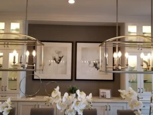
A room with dramatic stone, custom cabinetry, artwork, or patterned furnishings may need quieter walls. A more restrained room can support stronger color.
- Keep walls quieter when architecture and furnishings already provide detail.
- Use deeper color where the room needs contrast.
- Let built-ins, paneling, or cabinetry carry the color when the architecture provides a stronger focal point.
Pro Painters frequently works with custom architectural details and specialty finishes, so color is considered alongside the room’s construction and finish.
How will the color work with adjoining rooms?
If several rooms are visible at once, evaluate the colors together.
- Keep connected spaces within a compatible temperature.
- Use foyers and hallways to create continuity.
- Allow dining rooms, studies, or libraries to carry deeper color when appropriate.
The rooms do not have to match. They need enough relationship to feel intentional.
For whole-home planning, see our guide to how many paint colors to use in a house.
How to Test Paint Color Before You Commit
How many paint colors should you sample?
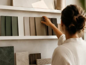
Testing too many similar colors usually creates more confusion. Narrow the selection to 2 or 3 realistic candidates.
- Compare samples with flooring and trim.
- Place them beside cabinetry and stone.
- View them from adjoining rooms.
- Check them in morning, afternoon, and evening light.
The strongest choice should work with the room as a whole, not just look good on a paint chip.
What should you look for before approving a color?
Before making the final decision, look for changes in undertone, contrast, and how the color relates to nearby finishes.
- Watch for pink, yellow, green, or gray undertones.
- Check how the color looks beside existing whites.
- Compare it under both natural and artificial light.
- Make sure it still works from adjoining rooms.
Pro Painters LTD works with homeowners, interior designers, architects, and builders throughout Metro Detroit. Learn more about our interior painting services or schedule a color consultation.