A Fresh Start with Paint Trends
Thinking about refreshing your space this year? The best interior paint colors for 2026 offer plenty of inspiration, from soft whites and warm neutrals to nature-inspired greens and deep, enveloping shades.
From calming neutrals to expressive statement shades, the right color doesn’t just change a room — it transforms how you feel in it. But here’s the thing: choosing the right interior paint isn’t just about picking a pretty swatch. It’s about understanding your space, lighting, and style — and that’s where the pros come in.
A professional painting service does more than deliver clean lines and flawless coverage. They guide you in selecting shades that work with your unique home layout and goals, ensuring you get a color you’ll love not just this season, but for years to come.
In this post, we’ll explore the top paint color trends for 2026 for home interiors — the hues homeowners and designers alike can’t stop talking about. Whether you’re dreaming of a cozy retreat, a bold office update, or a timeless family space, there’s a trend (and a professional) to help make it happen.
Embracing Nature — Earthy Tones and Organic Hues
One of the most noticeable shifts in top paint color trends for 2026 is the strong embrace of natural, earthy tones. This movement isn’t just aesthetic — it’s rooted in a growing desire to bring the calming energy of nature indoors.
Biophilic Design is Driving the Palette
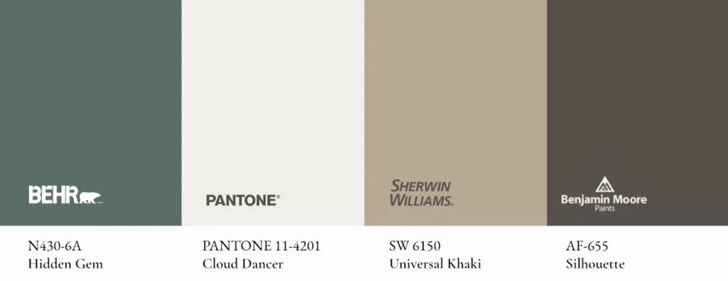
Biophilic design, which centers around the human connection to nature, is influencing everything from architectural layouts to interior color choices. For 2026, we’re seeing a surge in grounded shades like deep forest green, warm clay, earthy tan and rich brown-charcoal, along with softer supporting neutrals like creamy off-white. Benjamin Moore describes its 2026 palette as balancing deep and delicate hues.
These tones don’t just look beautiful — they create a sense of grounding and peace, making them ideal for high-traffic areas like living rooms, bedrooms, and entryways.
Colors of the Year to Watch
- Smoky Green: Calm and organic, it brings a subtle connection to nature while adding more depth than a traditional neutral.
- Soft White: Airy and understated, it creates a clean foundation that lets surrounding finishes, furnishings and architectural details stand out.
- Warm Khaki: Grounded and versatile, it adds warmth without feeling heavy and works especially well with wood, stone and natural textures.
- Deep Brown-Charcoal: Rich and enveloping, it adds contrast, intimacy and architectural definition to a room.
Why It Pays to Hire a Pro
While these natural hues are stunning, they’re also nuanced. A color that looks soft in the store can turn muddy or overly dark once applied, especially in rooms with limited light. This is where professional expertise becomes invaluable.
A seasoned painter can evaluate your space, test lighting conditions, and ensure even coverage and accurate tone, making sure your earthy color feels intentional and inviting, not dull or flat.
Soft Minimalism — The Reign of Warm Neutrals
If 2026 had a design mantra, it might be “soft, grounded, and intentional.” Minimalism is continuing to move away from stark whites and cool greys, making room for warmer neutrals, smoky greens, soft whites, and deeper brown-charcoal tones. The result is a palette that feels calm and refined, with enough depth and warmth to make a room feel finished rather than bare.
From Cold to Cozy: The New Neutrals
Expect to see rich off-whites, creamy taupes, soft beiges, and pale blush tones dominating interiors this year. These colors bring in light without feeling sterile — perfect for open-concept living rooms, kitchens, or transitional spaces.
Popular warm neutrals for 2026:
- Soft White — light and versatile, with enough warmth to keep a room from feeling stark.
- Warm Khaki — earthy and grounded, especially effective with wood, stone, and natural textures.
- Creamy Taupe — soft and adaptable, adding depth while still functioning as a neutral.
These hues are subtle, but they’re not bland — they invite warmth and depth without overpowering the space.
Let There Be (Strategic) Light
Lighting makes all the difference with warm neutrals. Natural light can bring out undertones that artificial lighting can’t, and vice versa. That’s where hiring a professional pays off — an expert can evaluate the lighting conditions in each room and recommend the best paint colors for your interior based on how they’ll look on your walls.
Color Pairings that Work
Professionals often recommend layering warm neutrals with soft textures — think woven rugs, wood finishes, or linen curtains. And while this blog won’t offer DIY instructions, it’s worth noting that a cohesive palette across adjoining spaces can subtly expand the feel of your home — a strategy painting pros are well-versed in.
Bold But Balanced — Deep Colors Making a Statement
While neutral tones remain popular, 2026 is also making room for deeper, more expressive color. Rich brown-charcoal, smoky green, deep navy, and earthy red tones are being used to add contrast, intimacy, and definition. When used thoughtfully, these shades can give a room more depth without making it feel overly dramatic.
Where Bold Works Best
These dramatic shades shine in:
- Dining rooms – for a cozy, intimate vibe.
- Home offices – to inspire focus and sophistication.
- Accent walls – adding depth without overwhelming the space.
When used correctly, bold paint creates visual drama and contrast, especially when paired with lighter trim or natural textures. But getting it right requires a thoughtful hand.
The Professional Edge
Dark colors are notoriously tricky to apply. They tend to magnify flaws in the wall surface, and uneven application can lead to streaking or patchiness. That’s why professional prep work — from surface smoothing to proper priming — is non-negotiable for these shades.
A painting pro ensures:
- Flawless coverage across every wall.
- Consistent tone, even in challenging lighting.
- Longevity, thanks to the use of high-quality materials and finishes.
Maintaining the Look
After application, deeper hues need a bit more TLC. Dust and scuffs show more easily on navy or black walls, but don’t worry — pros often recommend washable, low-sheen finishes for high-touch areas to help keep your space looking fresh long after the last brushstroke.
Wellness Through Color — Muted, Restorative Hues
In 2026, softer color continues to play an important role in interiors, especially for homeowners who want rooms to feel calmer and more restorative. Muted greens, dusty blues, softened blush tones and gentle neutrals bring color into a space without overwhelming it.
These shades feel more sophisticated than traditional pastels, with enough depth and subtlety to create a relaxed atmosphere while still working naturally with wood, stone, textiles and other finishes.
Color as a Mood Booster
Soft lavender, pale blush, seafoam, and powdery blues are being used to turn ordinary rooms into restorative spaces. These hues are showing up in:
- Nurseries – gentle colors for a calming atmosphere.
- Home offices – to reduce stress and promote focus.
- Wellness areas or meditation corners – encouraging rest and reflection.
Studies have shown that color plays a key role in how we feel in our homes. And while everyone responds differently, soft shades generally promote clarity, peace, and mental ease.
Tailored for Your Light, Your Life
Choosing softer hues isn’t always straightforward, especially with natural lighting and existing decor at play. A professional painter can help you:
- Select the right undertone for your specific light exposure.
- Avoid shades that turn too cool or washed-out.
- Recommend durable finishes that protect delicate colors from fading.
These lighter colors may look simple, but the strategy behind applying them successfully is anything but. That’s where the pros shine — helping your color choices support the emotional tone of your space.
Timeless Meets Trendy — The Return of Classic Combos
Trends come and go, but some color pairings earn a permanent place in design. In 2026, we’re seeing a revival of classic combinations — think navy and beige, black and white, charcoal and cream — reimagined with a modern twist. These timeless palettes are a smart choice for homeowners who want to stay current and boost long-term appeal.
Balancing Trend with Longevity
Not everyone is ready to commit to a deep emerald ceiling or a fully charcoal colored room. Classic pairings offer a way to participate in current trends without sacrificing versatility. They work in:
- Living rooms – where cohesion and comfort matter.
- Entryways – for an elegant first impression.
- Rental or resale-focused properties – where broad appeal is key.
Designers and pros are using these palettes to anchor a home’s color story while adding fresh energy through contrast, texture, and sheen.
Why Pros Know What Works
Pulling off a color combo may sound simple, but balance is everything. Too much contrast can feel jarring, while mismatched undertones can create dissonance that’s hard to pin down. Professional painters bring experience and design awareness to help you:
- Layer tones that complement one another naturally.
- Use accent walls or trim to create intentional separation.
- Avoid overusing a trendy color in a way that might date the space later.
When done right, classic combos don’t feel safe — they feel smart. And in a year where versatility and calm both matter, that’s a win-win.
Finishes Matter — Enhancing 2026 Colors with the Right Texture
The color itself is only one part of how a painted surface feels.
Matte, eggshell, satin, semi-gloss and gloss each interact with light differently. As sheen increases, reflections become more pronounced and the color can appear richer, deeper or more dimensional.
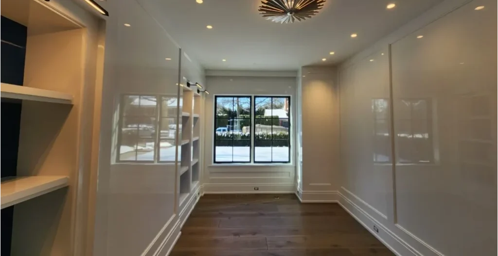
A muted green in matte can feel soft and organic. The same general color family on glossy cabinetry can feel polished and architectural.
When the Finish Becomes Part of the Design
Higher-sheen finishes are particularly striking on:
- Cabinetry
- Built-ins
- Doors
- Trim
- Millwork
- Architectural features
They also demand more from the underlying surface. Reflected light can reveal imperfections that would disappear within a flatter finish.
With high-gloss or specialty work, the surface and finish become inseparable from the color itself.
What’s Trending in Paint Finishes
This year, the spotlight is on finishes that add dimension without overwhelming the room. With softer colors like Pantone’s Cloud Dancer and other warm neutrals playing a larger role in 2026, sheen becomes part of how the color is experienced.
- Matte & Flat: Soft, low-reflective finishes that work especially well with whites, warm neutrals and muted colors.
- Eggshell & Satin: A subtle sheen that adds durability while keeping the finish understated.
- High-Gloss & Lacquer: Increasingly used on cabinetry, built-ins, doors, ceilings and architectural details where reflection can add depth and visual interest.
Each finish changes the way a color responds to light. A soft white can feel quiet and diffused in matte, while the same color family becomes brighter and more dimensional in high gloss.
Finish Selection = Professional Strategy
Professionals know that finish affects more than appearance. It also influences:
- Maintenance: Higher-sheen finishes are generally easier to clean, but they reveal more surface imperfections.
- Durability: High-traffic areas often benefit from finishes designed to withstand more wear.
- Lighting: Gloss reflects more light, while matte absorbs it, changing how the color reads throughout the day.
That’s why finish selection is rarely one-size-fits-all. The right choice depends on the room, the surface, the lighting and the effect you want to create. Professional interior painting can help ensure the color and finish work together as intended.its-all decision. A pro painter will walk you through your lifestyle needs, lighting conditions, room size, and long-term goals to help you choose the right interior paint finish that performs and lasts.
2026 Is the Year to Refresh Your Space
As we’ve explored, the best paint colors for home interiors in 2026 go far beyond aesthetics—they’re rooted in how we live, feel, and connect with our homes. From earthy neutrals that ground us to bold shades that energize us to calming pastels that promote wellness, this year’s palette is all about creating grounding spaces that reflect your personal story.
But choosing the right color — and applying it flawlessly — isn’t just about taste. It’s about technique, timing, and knowing what works in your unique space. That’s why working with a professional makes all the difference. Whether you’re refreshing one room or reimagining your whole home, expert painters can help you bring your vision to life without second-guessing a thing.
So if you’ve been thinking about a change, now’s the perfect time to start. Ready to transform your home with the top color paint trends for 2026 palette?
Schedule your consultation today with our expert team — and let’s bring color, comfort, and style together.