Are You Using Too Many Paint Colors in Your Home?
Most homeowners enjoy adding personality to their interiors through color. But sometimes, the desire for variety turns into visual clutter. When every room has its own bold palette or competing tones, the overall home can start to feel disjointed and busy.
This is especially common in open-concept layouts or smaller homes, where sightlines connect multiple rooms at once. What looks great in isolation may clash when viewed from the next doorway.
If you’re wondering how many paint colors should a home have, you’re not alone. The answer depends on your layout, lighting, and personal style — but most professionals agree: a curated, consistent palette always outperforms an unstructured one.
This blog walks through the impact of too many paint colors, the recommended number to use, and how a pro painter can help bring clarity to your home’s color story.
How Color Impacts Space, Mood, and Perception
Each color you choose has a job to do. In home interiors, that job includes shaping mood, enhancing natural light, and creating flow from one room to the next.
Inconsistent color usage can overwhelm the senses. Even beautiful shades can clash if there’s no clear design logic behind them. When colors compete, your home feels disjointed — not intentional.
Here’s what too many colors can do to a space:
- Visually shrink rooms, especially when using deep or saturated hues on every wall.
- Break up flow in open layouts or hallways, making the home feel like disconnected zones.
- Overwhelm the eye, reducing contrast and diminishing architectural features or focal points.
- Introduce mood inconsistency, especially if each room sends a different emotional signal.
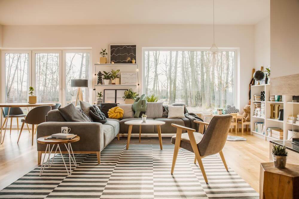
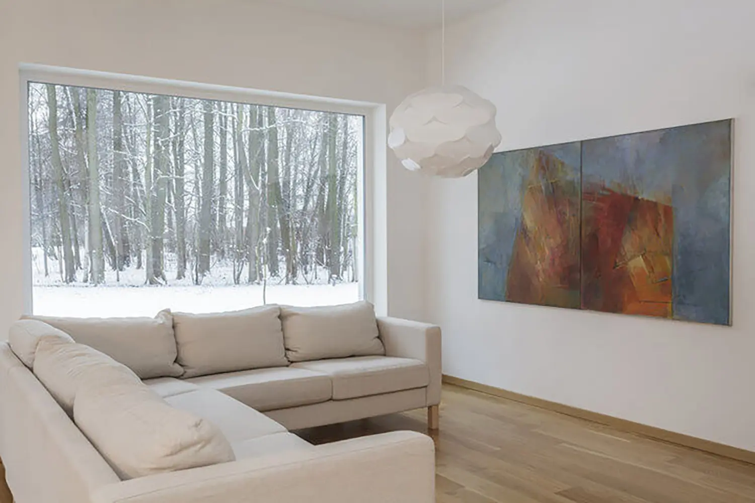
On the other hand, a unified palette helps your home feel calmer, more open, and easier to navigate. It also makes decorating easier since furniture and accessories don’t have to work as hard to tie things together.
That doesn’t mean every room should look the same. But the more purposeful your palette, the more polished your home will feel — regardless of size or style.
The General Rule: How Many Paint Colors Is Too Many?
There’s no one-size-fits-all answer, but most designers and painting professionals recommend sticking to 3 to 5 core colors throughout the home. This creates consistency, simplifies transitions, and keeps your palette feeling intentional.
Those core colors might include:
- One main wall color used in shared areas or larger spaces
- One or two coordinating tones for bedrooms, offices, or bathrooms
- A flexible neutral for ceilings, trim, or accent features
- Optional bold accents, such as a deep blue entry wall or painted interior door
Using more than five paint colors in one home can work — but only if the finishes, lighting, and undertones are carefully balanced. Without that level of planning, the result can feel like a patchwork of trends instead of a connected visual story.
Remember, fewer colors doesn’t mean less personality. Professionals often achieve dramatic, customized interiors with only three or four paint shades, simply by adjusting finish, placement, or pairing with the right lighting and materials.
When It’s Time to Simplify Your Palette
Too many paint colors might not be obvious right away. Often, the signs show up subtly — in how you feel walking through your home or how difficult it becomes to make simple updates.
Here are common indicators your home may be overloaded with color:
- Every room feels like its own design project, with no visual connection to the next
- You struggle to pick furniture or art, because nothing feels cohesive from one space to the next
- Transitional areas like hallways or stairwells feel jarring, due to clashing color changes
- You’re avoiding repainting, because matching trim, ceilings, or other elements has become too complex
- Guests comment on how “busy” the space feels, even if they can’t pinpoint why
Simplifying your color scheme creates more flexibility — not less. You’ll find it easier to swap rugs, pillows, or light fixtures without needing to rethink every wall color in the house.
It also boosts resale potential. Most buyers want to see clean, consistent color choices that feel livable and timeless — not trendy or highly personalized combinations that require immediate repainting.
A neutral, edited palette doesn’t have to be boring. It’s the backdrop that allows your home’s details — from crown molding to art — to really shine.
Why a Professional Color Consultation Is Worth It
Color selection isn’t just about taste — it’s about how paint behaves in real space, under real lighting, next to real materials. And that’s where a professional color consultation becomes invaluable.
Here’s what a color expert brings to the table:
- A trained eye for undertones, which helps avoid mismatched colors that clash under changing light
- Knowledge of layout and flow, ensuring that color transitions feel natural across rooms and sightlines
- Awareness of finishes, lighting, and material textures that may alter how a shade appears in each space
- Balance between trend and timeless, helping homeowners avoid trendy palettes that feel dated within a few years
- A cohesive color plan, saving time and reducing expensive repainting mistakes in the future
Painters who offer color consultation services look beyond swatches. They evaluate the unique character of your home, understand your goals, and help you build a palette that suits your lifestyle — not just the latest Pinterest post.
Even if you already love your current colors, a second opinion can help identify where slight adjustments could bring better flow, balance, and long-term satisfaction.
A Balanced Palette Adds Calm, Not Clutter
Your home should feel inviting, not overstimulating. While color is one of the most personal ways to express your style, too much variety can easily turn your interiors into a visual maze.
Here’s what to remember:
- Stick to 3 to 5 carefully chosen colors that reflect your layout, lighting, and lifestyle.
- Use bold accents intentionally, and only when they support the flow of your home.
- Watch for signs that your palette is too busy — and simplify when cohesion starts to suffer.
- Lean on professional color consultations to ensure every shade works in harmony, not competition.
A curated color scheme isn’t boring — it’s intentional. With expert guidance, your home can feel more connected, more peaceful, and more like you.
Thinking of updating your paint palette? Book a color consultation and get help creating a cohesive scheme that makes every room feel complete.
Leave a Reply